
The context
Chiaki is a fashion label bringing traditional textile character into a contemporary ecommerce setting. Its catalogue spans expressive sarees, handwoven textile details, block prints and modern silhouettes across womenswear and menswear.
The product already carried colour, texture and personality. The digital challenge was to build a storefront capable of presenting those qualities with the same sense of consideration. A standard Shopify layout could make the catalogue available, but availability alone would not create a premium brand experience.

The client requirement
The requirement was clear: the store had to feel polished and premium without becoming loud, over-designed or difficult to shop. The client wanted a fashion experience with editorial confidence, but it still needed to behave like a dependable ecommerce product.
That created a useful tension. The site needed large visual moments and a distinctive atmosphere, while navigation, product discovery, sizing, price information and purchase actions had to remain immediate. We treated premium not as decoration, but as the result of better hierarchy, calmer decisions and consistency across the complete journey.
Let the products and campaign imagery carry the emotional weight.
Make every shopping action clear without making the interface feel transactional.
Preserve one coherent brand system from the first viewport to the cart.
Starting with the shopping journey
We approached the project as a product-design exercise before treating it as a theme-customisation task. The key question was not simply how the homepage should look; it was how a visitor should move from discovering Chiaki to finding a relevant category, understanding a product and making a confident purchase decision.
We mapped the storefront around four stages: brand introduction, guided discovery, product evaluation and purchase. This prevented the homepage from becoming a sequence of disconnected promotional sections and gave every part of the store a clear role.
Brand introduction
The opening experience needed to establish Chiaki’s tone immediately through strong campaign photography, restrained copy and a direct route into the collection.
Guided discovery
Collections, colour-led browsing, new arrivals and editorial content were organised as distinct ways to explore the catalogue instead of repeating the same product grid.
Product evaluation
Product imagery, names, prices, size selection and supporting details were given a clearer hierarchy so customers could evaluate an item without searching across the page.
Purchase
Add-to-cart and cart interactions were treated as a continuation of the product experience, with clear feedback and fewer moments of uncertainty.
Building the premium visual system
The interface was built around a warm off-white foundation rather than stark white. This gave the photography and textile colours room to feel rich while keeping the overall experience calm. Accent tones were used sparingly, and borders were kept fine so the store felt structured without becoming boxed in.
Typography was organised into a compact hierarchy: expressive campaign statements, clear editorial headings and practical product information. We avoided unnecessary font changes, excessive weights and decorative treatments. The result is a system that feels fashion-led while remaining readable throughout long collection and product pages.
A quieter palette
Warm neutral backgrounds, dark desaturated text and controlled accents create contrast without the harshness of a generic catalogue template.
Consistent image behaviour
Product and campaign images use deliberate aspect ratios, cropping and spacing. This makes mixed photography feel like one collection rather than a set of unrelated uploads.
Micro-interactions with restraint
Hover states, image transitions and shopping feedback were designed to feel smooth and useful. Motion supports recognition and continuity; it does not interrupt browsing.


Warm surfaces and restrained typography were chosen to support saturated textile colour.
Restructuring the homepage
The homepage was designed as an editorial storefront rather than a long catalogue. A strong image-led hero establishes the brand, followed by multiple forms of product discovery that keep the page visually varied and commercially useful.
The navigation was refined into a cleaner fashion-commerce structure, with essential social links separated from core shopping routes. This gives the primary navigation more focus while keeping the brand’s wider presence accessible.
Campaign-led hero
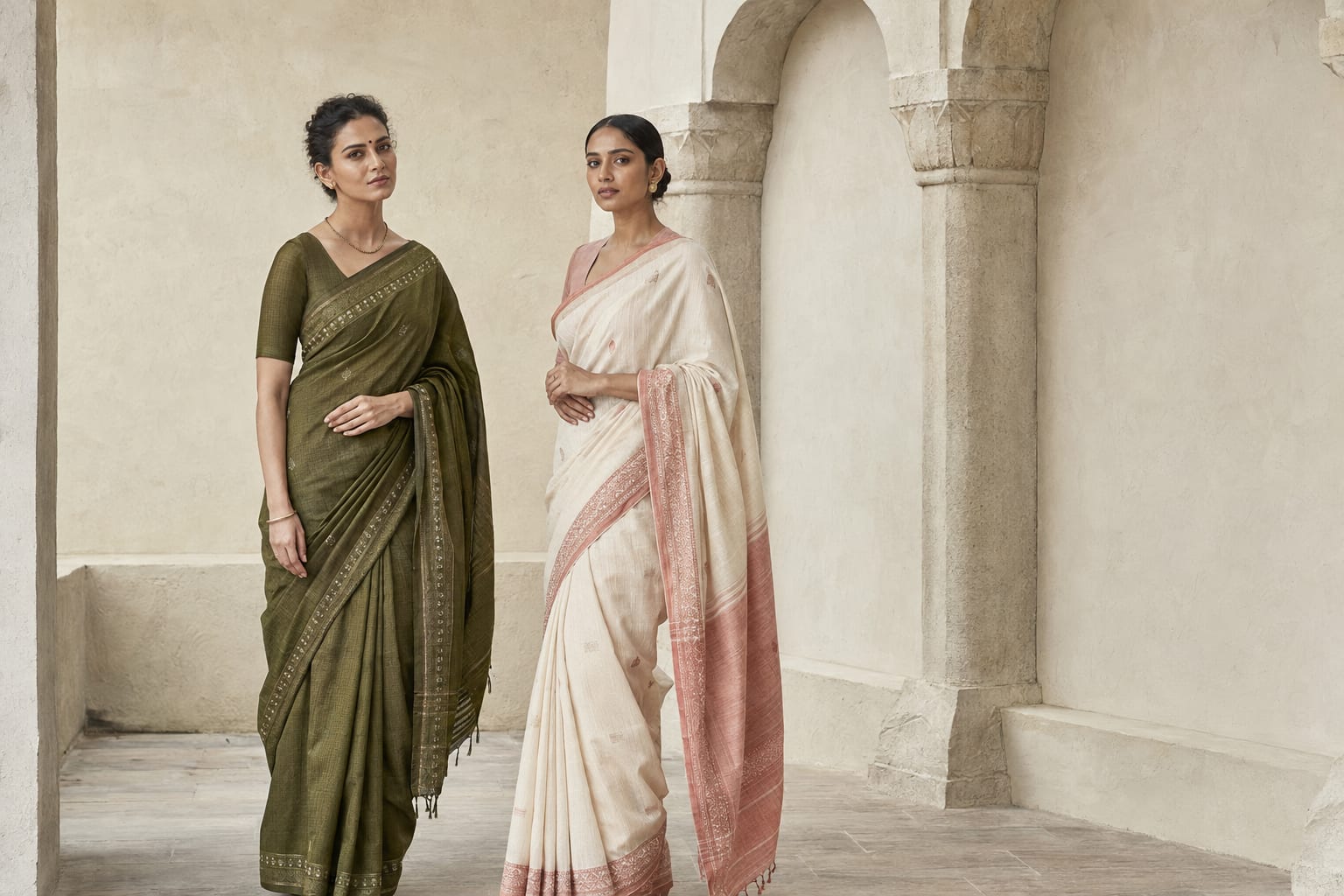
The hero combines full-bleed imagery with concise overlaid messaging and a clear collection action. Text is positioned and contrasted so the visual remains immersive without compromising readability.
Category and colour-led discovery
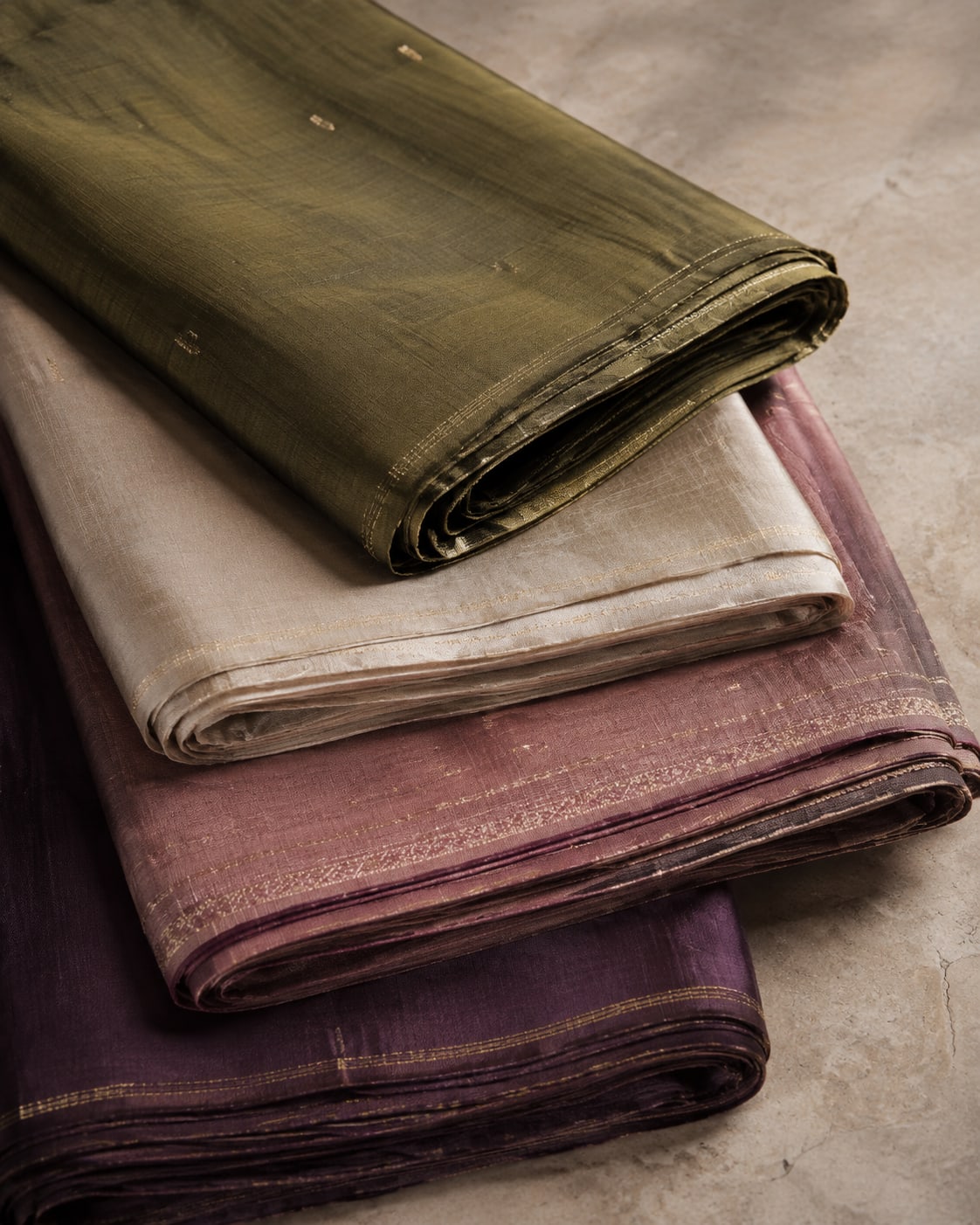
Traditional category browsing is complemented by a Shop by Colours experience. Colour is central to how customers understand fashion, so we turned it into a useful discovery route instead of treating it as decoration.
Reels as product context
A reel-led section gives the store space for movement, styling and social proof. Positioned within the shopping journey, it adds energy without displacing more important product information.
Rhythm instead of repetition
Image-led sections, product grids, editorial moments and calls to action use different compositions. This avoids the repetitive stacked-card feeling common in template-based stores.
Improving collection discovery
Collection pages are where visual ambition has to meet shopping efficiency. We retained Chiaki’s design language while improving the practical tools customers need when browsing a growing catalogue.
The page introduces the collection with meaningful context instead of a generic “Products” heading. Product cards give names, pricing and purchase actions a clearer hierarchy, while filtering and sorting help customers narrow the catalogue without losing their place.
Before
- Generic catalogue heading
- Limited paths for narrowing products
- Product information competing for attention
- A grid that felt separate from the brand
After
- Editorial collection introduction
- Clear filtering and sorting
- Stronger product-card hierarchy
- Collection UX aligned with Chiaki’s visual system
Designing product pages for confidence
A premium product page should make the item feel desirable and the decision feel safe. We organised product imagery as the central storytelling surface, then created a clear purchase column for title, price, variants, sizing and the primary add-to-cart action.
Supporting information was progressively structured so customers could reach material, care, shipping or product details without confronting an oversized wall of copy. Related categories and products continue discovery below the core decision area rather than ending the journey abruptly.
A stronger image gallery
Front, back and close-detail imagery can be understood as one visual sequence, allowing the texture and construction of block-print and handwoven pieces to remain visible.
Clear variant selection
Size and variant choices use readable states for available, selected and unavailable options. The primary purchase action remains visually dominant.
Useful product context
Product details are grouped by purpose and revealed progressively, keeping the initial viewport focused while preserving the information needed for a considered purchase.
Carrying the experience into the cart and mobile
The cart was refined as part of the same system instead of accepting a default theme experience at the final step. Product identity, selected options, quantity, pricing and checkout hierarchy remain easy to scan, with clear feedback when the cart changes.
Mobile was designed intentionally rather than treated as a compressed desktop layout. Navigation, filter access, product imagery, sticky purchase actions, tap targets and section spacing were reconsidered for smaller screens. The brand retains its editorial quality, but the shopping path becomes faster and more direct.
Keep the product visible while customers confirm their selection.
Make price, quantity and checkout hierarchy immediately scannable.
Recompose for mobile instead of shrinking the desktop page.
Engineering the storefront in Shopify Liquid
The experience was implemented inside Shopify using Liquid, reusable theme sections and the platform’s native catalogue and cart data. This kept the storefront practical for the merchant while allowing the visual and interaction system to move beyond a stock theme.
Sections were structured so content and imagery can evolve without rebuilding the page. Responsive behaviour, reusable product patterns, collection templates and component states were handled at theme level, creating a more maintainable foundation for future campaigns and catalogue growth.
Merchant-editable sections
Campaigns, featured categories, editorial imagery and supporting copy can be managed through the Shopify theme editor instead of being permanently embedded in templates.
Reusable commerce components
Product cards, badges, price treatments, buttons and interaction states follow one shared system across homepage, collection and recommendation surfaces.
Designed around real catalogue content
The interface was tested against long product names, mixed image proportions, multiple sizes and changing inventory states so polish did not depend on ideal placeholder content.
The outcome
The finished storefront gives Chiaki a digital experience that is substantially closer to the quality and character of the products themselves. The brand now enters with a confident editorial first impression, then transitions into a clearer and more complete shopping journey.
Most importantly, premium presentation and ecommerce usability no longer compete. The visual system, catalogue structure, product pages, cart and mobile experience now feel like parts of the same product.
A more premium first impression
Campaign imagery, warm neutrals and disciplined typography give Chiaki a distinctive fashion-led presence from the opening viewport.
Clearer product discovery
Categories, colour-led browsing, collection tools and stronger product-card hierarchy help customers navigate the catalogue.
More confident product decisions
Better imagery, variant states, information hierarchy and purchase actions make product evaluation easier.
One consistent commerce experience
Homepage, collections, product pages, cart and mobile now follow the same brand and interaction system.
A maintainable Shopify foundation
Reusable Liquid sections and merchant-editable content support future launches without sacrificing design consistency.