The context
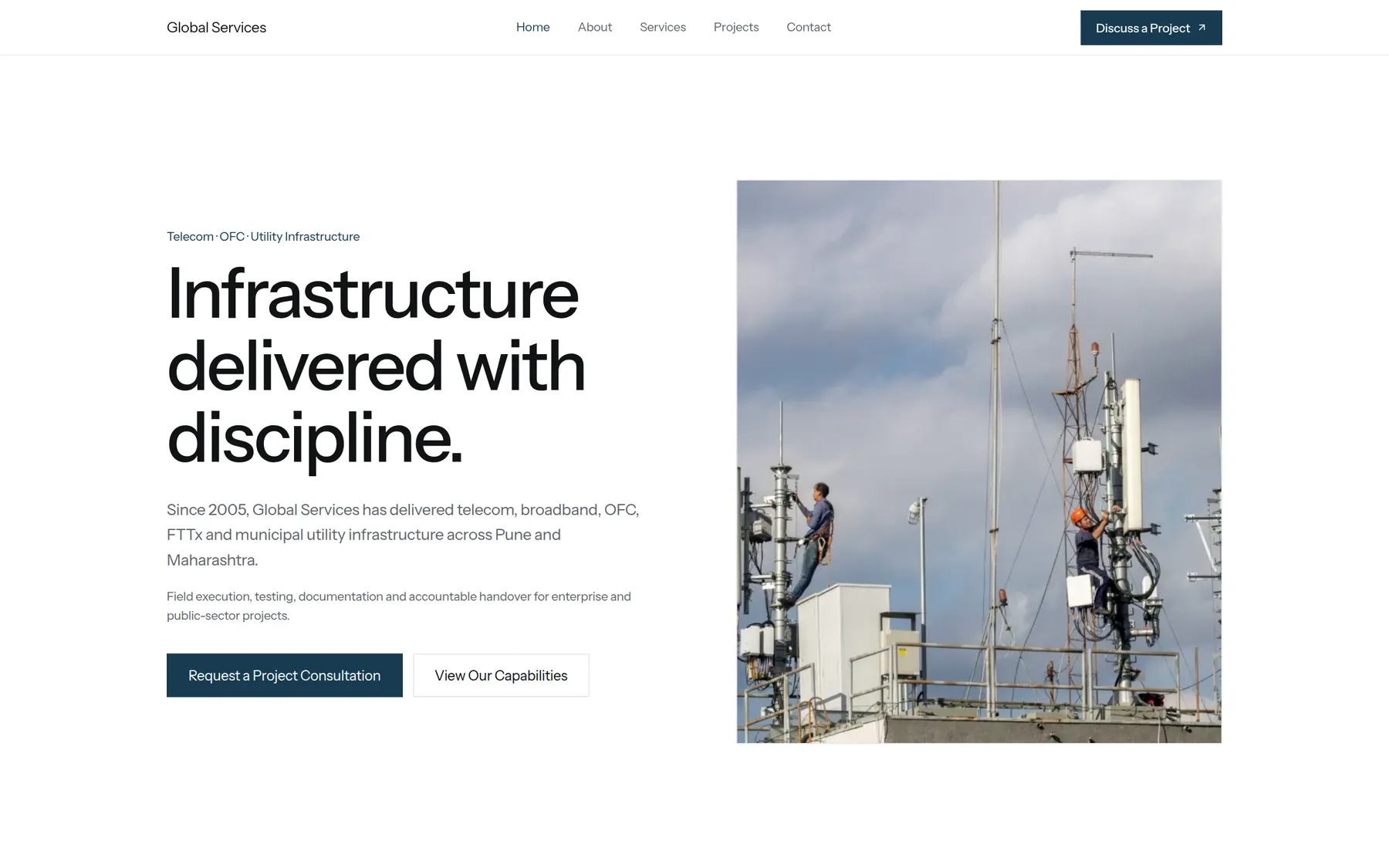
Formial Labs already had a capable product. The challenge was the path users had to take before they could experience its value.
New users needed to move from account creation through multiple setup decisions before reaching the active dashboard. The product worked — but the first-run experience did not make that clear quickly enough.
The problem
Onboarding was fragmented. Users had to understand too much before they had enough product context. That created uncertainty before activation.
The problem was not simply visual polish. It was sequencing: what information users saw, what action they were expected to take, and when complexity was introduced.

What we needed to solve
Instead of treating onboarding as a collection of forms, we treated it as one guided product journey.
Make the next action obvious.
Keep progress visible.
Get users to meaningful product value quickly.
The approach
Each screen should ask the user to understand or complete one thing. We reduced cognitive load by ordering the flow around decisions that build on each other, rather than asking users to plan the entire setup upfront.
Continuity mattered as much as clarity. Validation, progression and feedback needed to feel consistent from the first screen through to the active product state.
Designing the flow
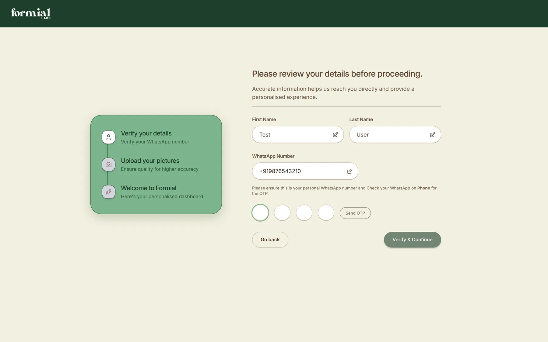
Account creation
The first screen needed to establish trust and set expectations without front-loading configuration. Users should understand what they were signing up for and what would happen next.
Progress and setup
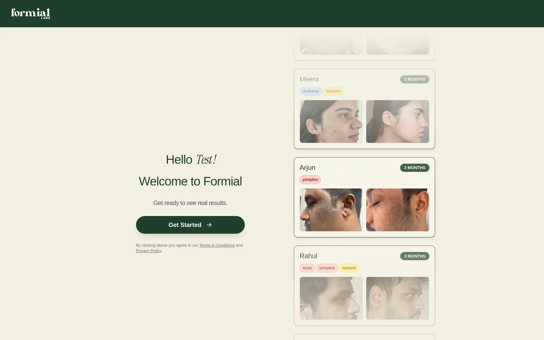
Visible progress matters when a journey spans multiple pages. Users should always understand where they are, what remains, and why the current step exists.
First useful action
The final transition needed to feel like arrival, not completion of paperwork. The journey should land users in a state where the product's value is immediately within reach.
Engineering the experience
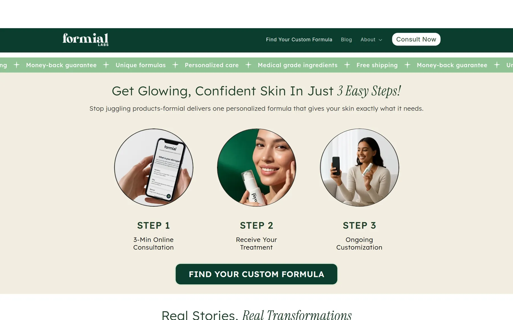
The work extended beyond visual design. We implemented the complete frontend journey, connected the individual onboarding states and ensured that validation, progression and feedback remained consistent between screens.
That meant building a multi-page onboarding flow end to end — UX, UI and front-end development — with each step doing one job in plain language and no dead ends between signup and activation.
The outcome
The final experience gives users a much clearer path from account creation to an active product state. Complexity is introduced progressively and each screen makes the next action clear.
Before
- Fragmented setup
- Unclear progression
- Product value delayed
After
- Signup
- Guided setup
- First useful action
What changed
The onboarding work changed how Formial Labs presents itself to new users — not through a single metric, but through a first run that finally matches the quality of the product underneath.
Clearer onboarding
Users always understand what comes next.
Reduced first-run friction
Complexity is introduced progressively instead of all at once.
Stronger first impression
The product feels considered from the first interaction.