The context
Vithub needed more than a placeholder site. As a consumer brand building recognition in a competitive category, they needed a credible digital identity — something marketing could point traffic at and convert.
The challenge was not simply building pages. It was defining how Vithub should look, communicate and feel online before a single campaign went live.
The problem
Without a strong website, growth efforts had nowhere meaningful to land. Traffic could arrive, but the brand would not feel established enough to convert interest into action.
Vithub needed a presence that felt considered from the first interaction — a site that reflected the brand they were building, not one they were still figuring out.
What we needed to solve
The project required both a visual communication system and a website structure that could support ongoing marketing — not a one-off landing page.
Establish a credible visual identity from the first frame.
Build a site structure that supports campaigns and product discovery.
Create a foundation marketing can grow on.
The approach
We treated the website as a brand system, not a template. Visual identity, typography, section rhythm and product presentation all needed to work together as one coherent experience.
Every section was designed to earn attention and point somewhere — whether that was product discovery, brand story or purchase.
Designing the website
Visual identity
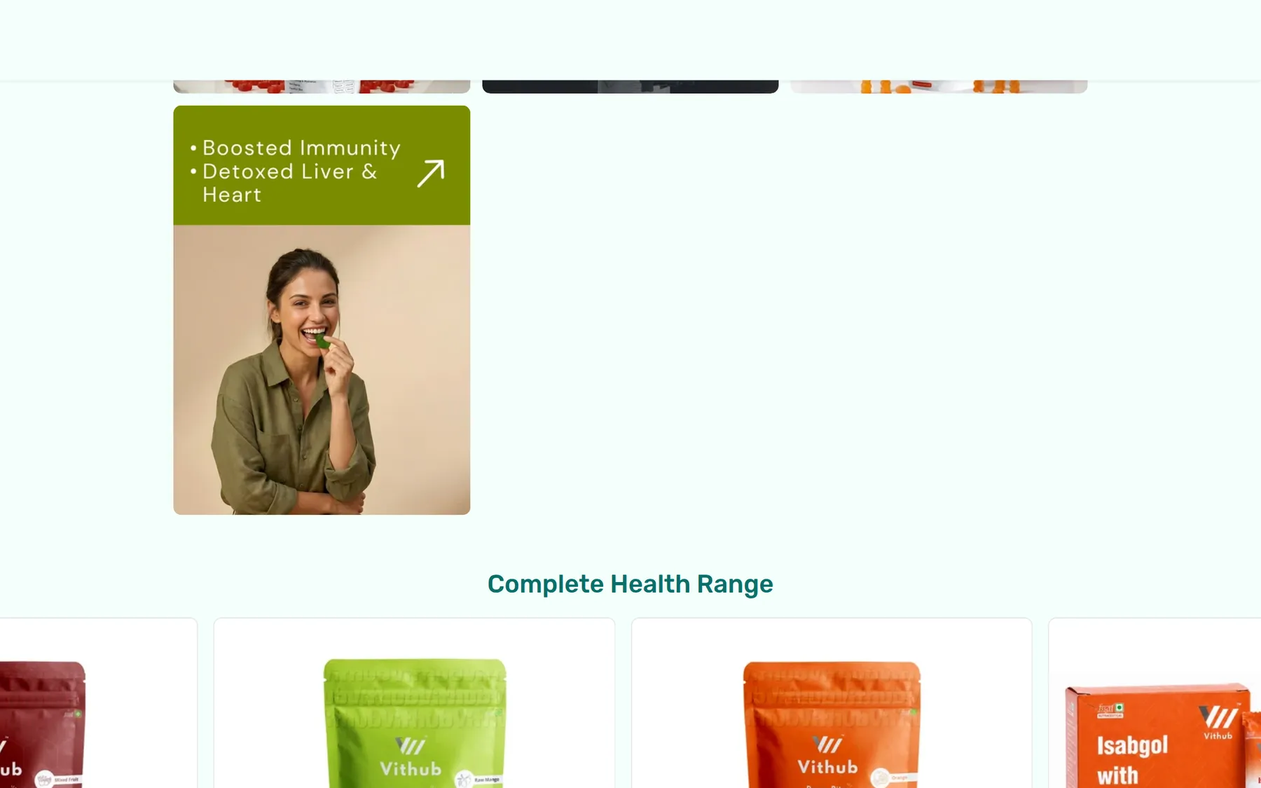
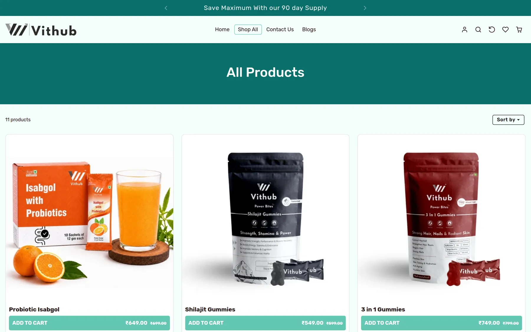
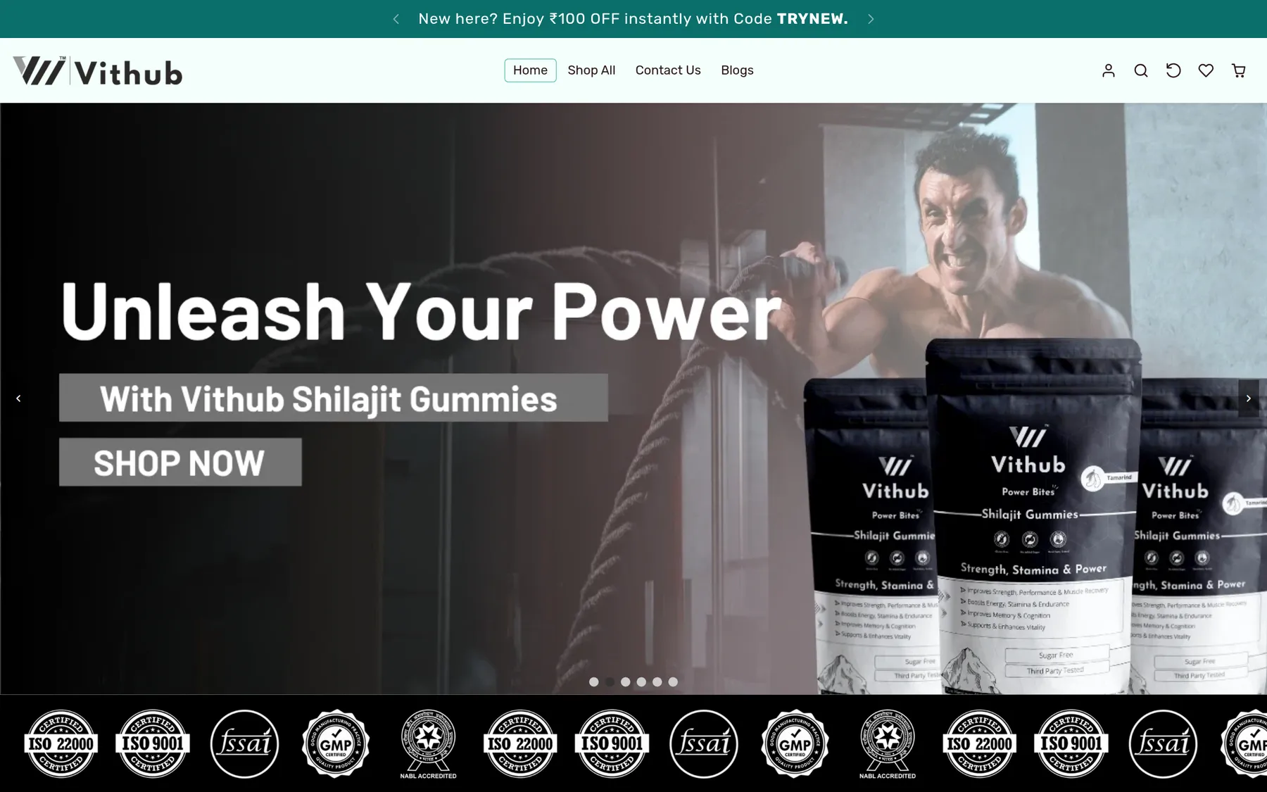
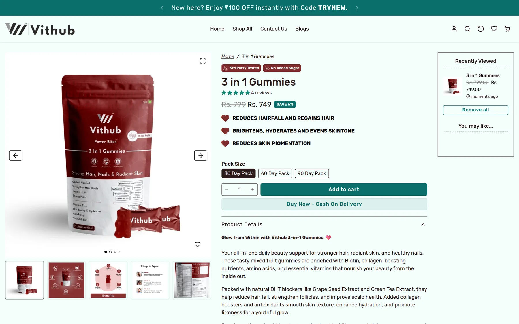
The site's visual language needed to make Vithub feel established at a glance — clean product photography, consistent spacing and a tone that matched the brand's positioning in wellness.
Site structure
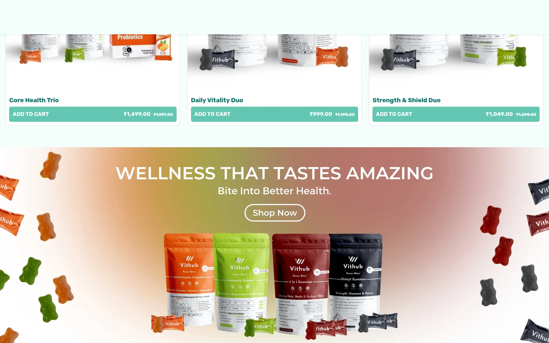
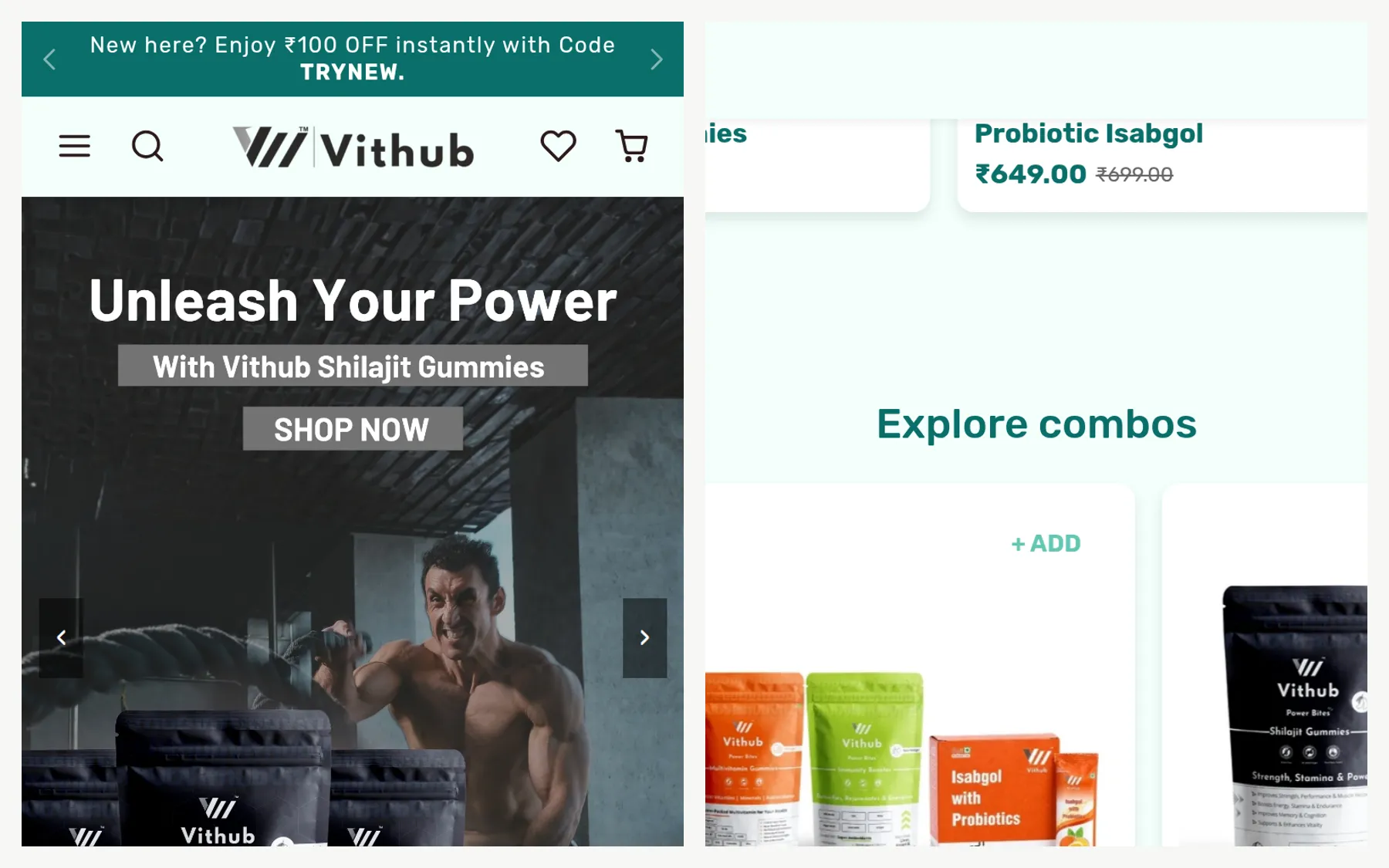
We built a structure that supports both discovery and conversion — product collections, campaign-ready pages and clear paths from first visit to purchase.
Campaign-ready foundation
The website was built as a foundation for ongoing marketing, not a single launch moment. Sections, templates and visual patterns can support future campaigns without rebuilding from scratch.
Building for growth
The project moved from brand definition into design and development as one engagement — so the visual system and the built site remained aligned throughout.
The result is a marketing-focused website with a strong, consistent identity: design-led from the first frame, built for campaigns, and ready to support user acquisition.
The outcome
Vithub now has a digital identity that matches the brand they were building. The site gives marketing and growth efforts somewhere credible to send traffic — and makes the brand feel established from the first visit.
Before
- No credible digital home
- Growth efforts without a destination
- Brand still finding its shape online
After
- Design-led marketing site
- Campaign-ready foundation
- Credible identity at first glance
What changed
Credible brand presence
Vithub now has a clear identity that makes the brand feel established at a glance.
A destination for growth
Marketing and acquisition efforts finally have somewhere meaningful to send traffic.
Campaign-ready foundation
The site supports ongoing marketing without needing to be rebuilt for every push.