The opportunity
Creative studios are judged before a visitor reads a single paragraph.
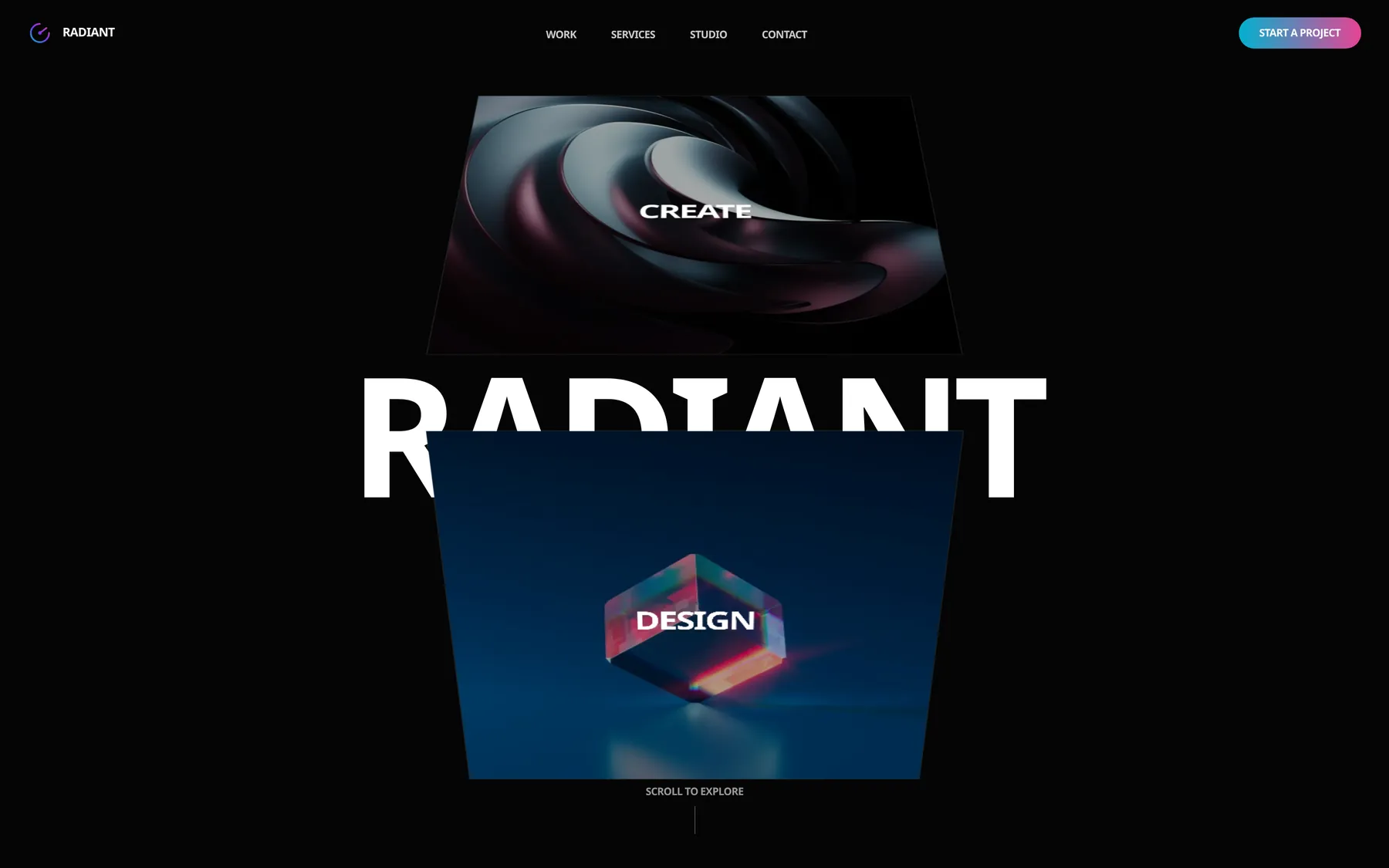
The site had to present strategy, identity, digital and motion without flattening them into a conventional agency grid — expressive enough to prove taste, structured enough to make a broad offer understandable, and direct enough to move serious visitors towards a conversation.
Experience strategy
A portfolio journey built around momentum.
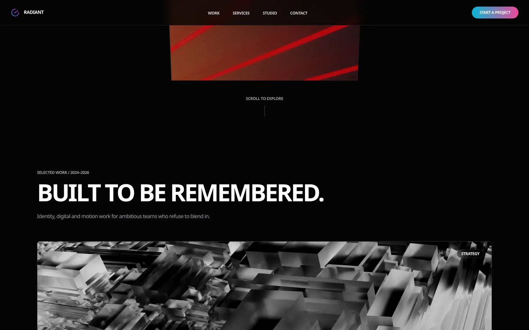
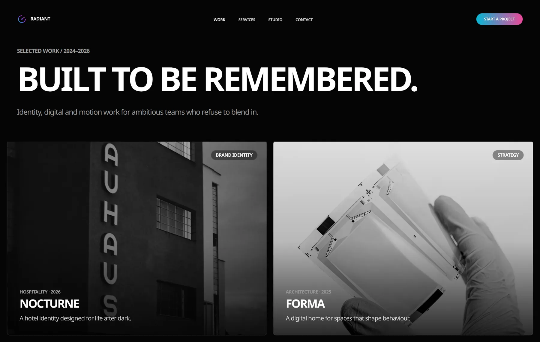
The homepage is one editorial sequence, not a stack of independent marketing blocks. Work establishes the standard. Positioning explains the thinking. Services add commercial clarity. Process reduces uncertainty. Engagement models and contact turn interest into action.
- 01Work
- 02Positioning
- 03Capabilities
- 04Process
- 05Engagement
- 06Contact
Selected work appears before lengthy company explanation.
Service breadth is organised without fragmenting the narrative.
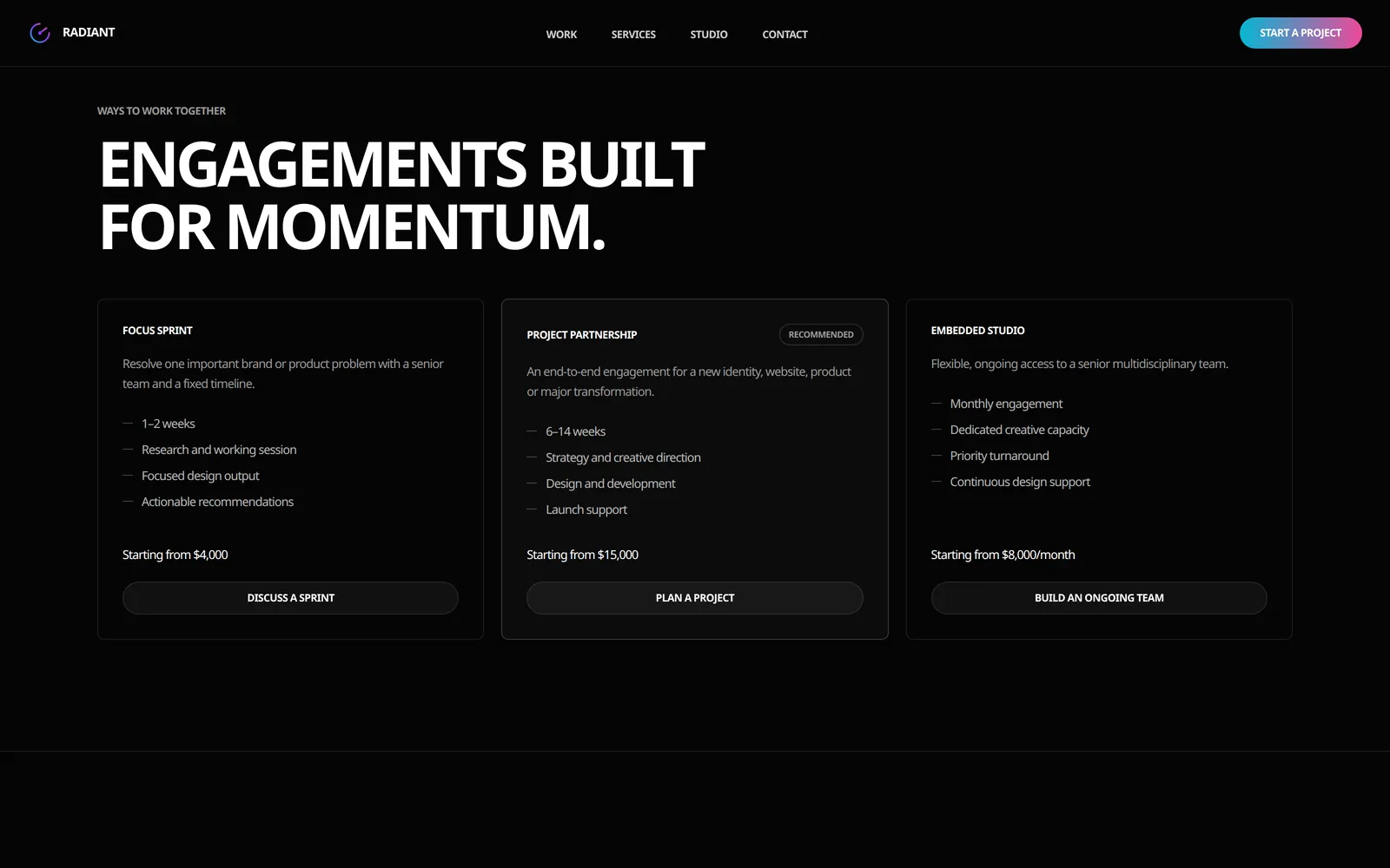
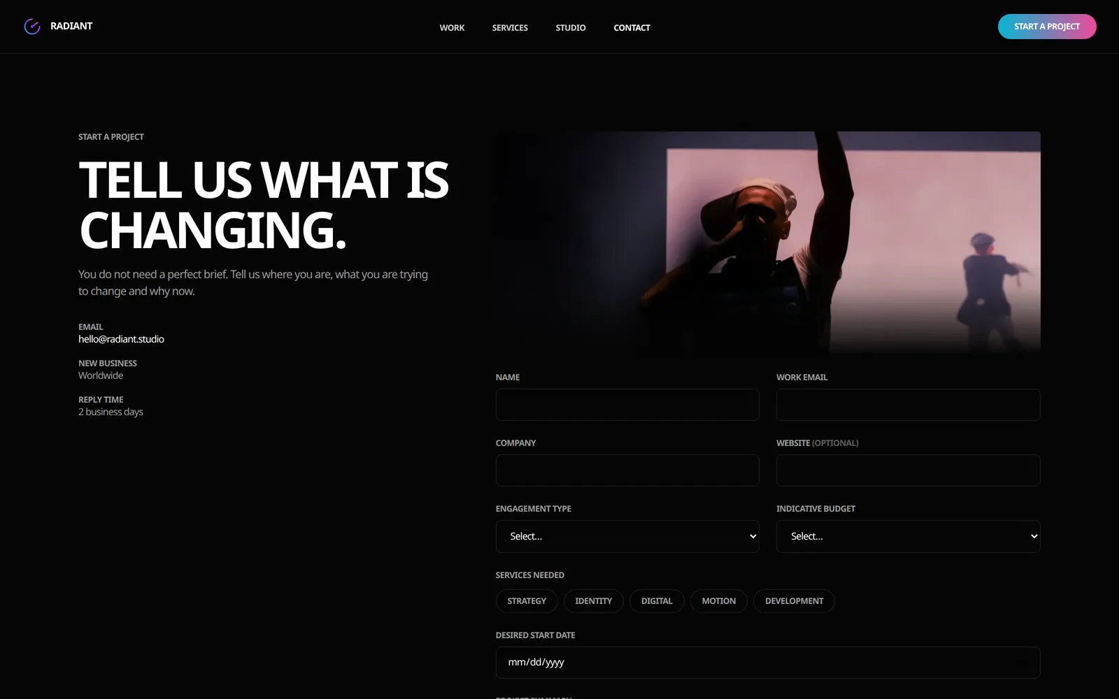
Pricing, process and contact qualify the enquiry instead of hiding it.
Visual system
Editorial restraint with moments of deliberate intensity.
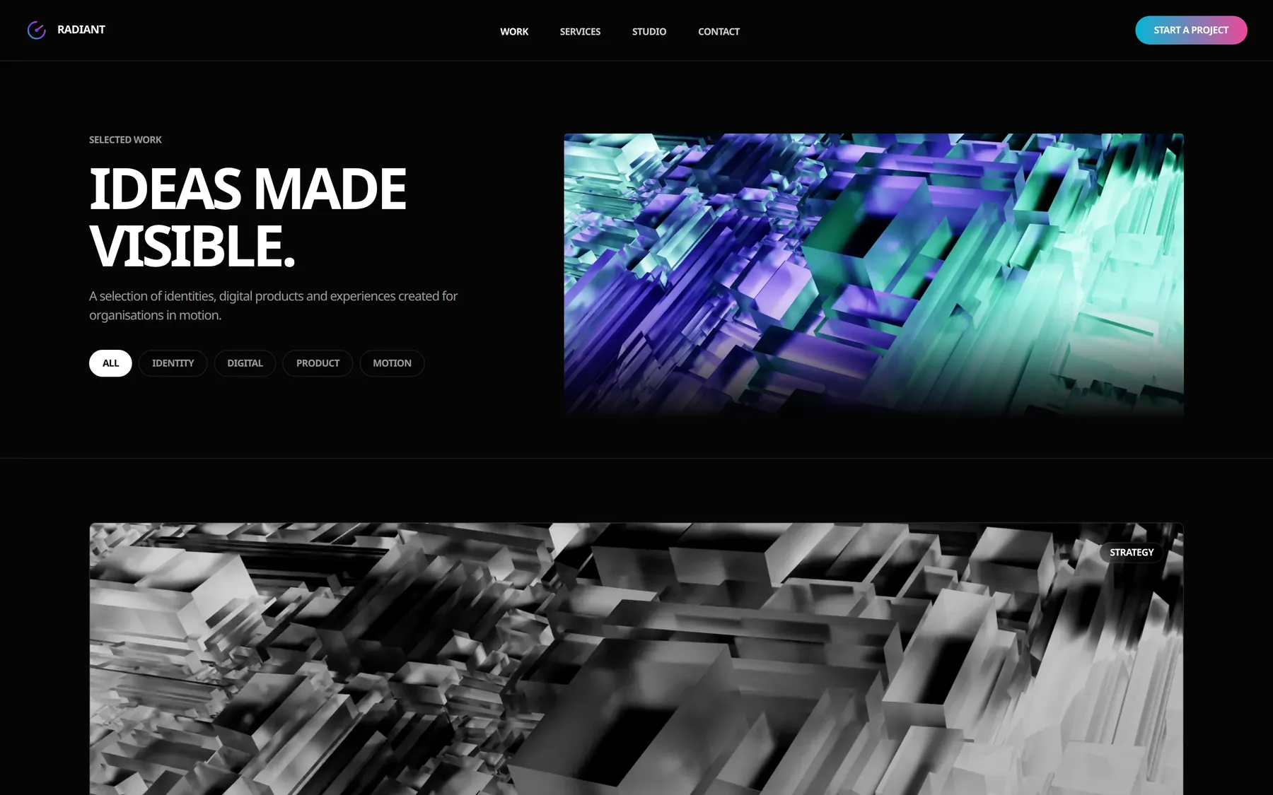
Oversized type, monochrome surfaces and cinematic imagery create contrast without visual noise. Motion is reserved for transitions, navigation and portfolio moments, so the work feels alive while the interface stays controlled.
- Typography
- Aspekta, set tight at display sizes. Colour appears only in the mark and primary action.
- Colour
- #050505 base, #111111 surfaces, #FFFFFF and #999999 text.
- Motion
- Viewport-triggered reveals, with a prefers-reduced-motion rule that disables looping animation.
From portfolio to enquiry
Different stories, one recognisable system — and a clear next step.
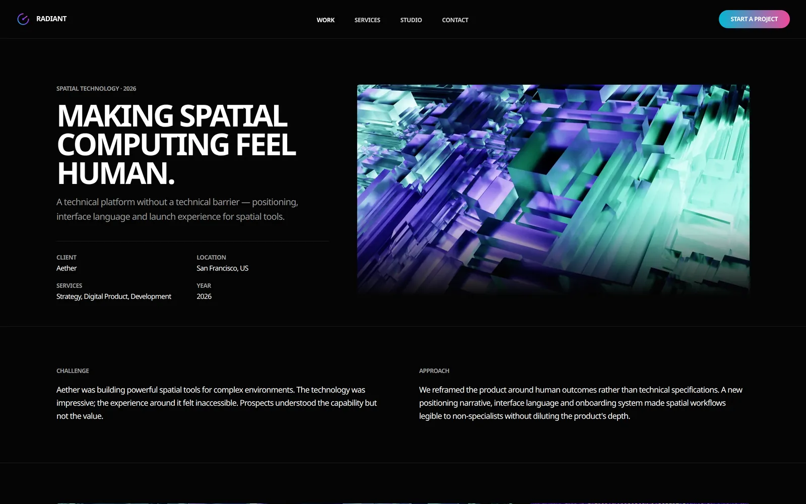
Project narratives across technology, hospitality, architecture and publishing keep the same hierarchy, metadata and pacing. Only the subject changes. Services, engagement models and a low-friction contact route then turn that attention into intent.
The outcome
A complete digital presence built to make creative work feel consequential.
Radiant brings portfolio, positioning, services, process and enquiry into one coherent experience — with enough clarity to sell complex capabilities and enough personality to remain memorable.
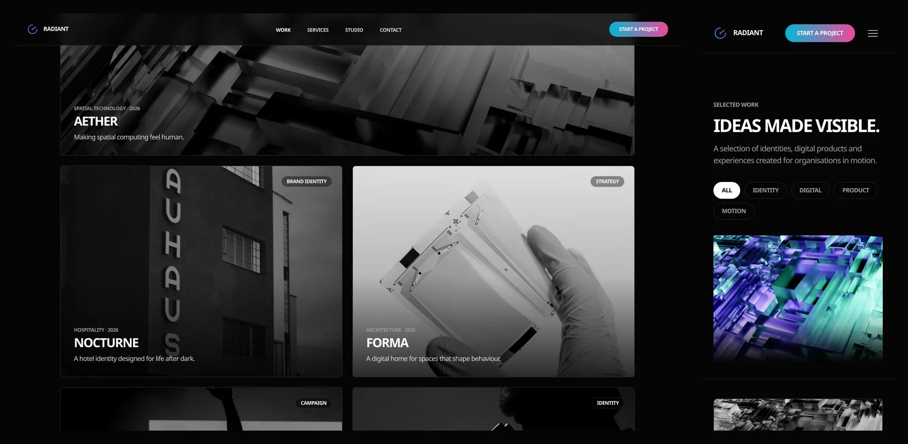
Stronger portfolio storytelling
A repeatable system gives varied projects individual character without losing consistency.
Clearer commercial structure
Services, process and engagement models turn a broad creative offer into an understandable buying journey.
Production-ready responsive experience
A complete multi-page implementation carries the same visual standard across desktop and mobile.